


Rust’s Menu Redesign Brings A Crisp And Modern Look
With the introduction of August’s “Harder Core” update, Rust’s menu has received a complete redesign, offering a much more modern look. All pages of the menu have been completely refreshed, including the Home, Play, Store, Inventory, and Settings tabs. Without further ado, let’s explore the new Rust menu redesign and all the quality of life changes it brings with it.

Check out the rest of the Harder Core update in our update guide:
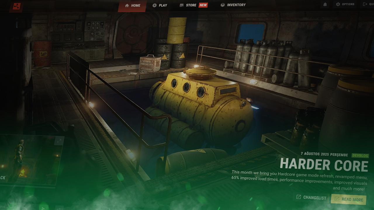
Home Tab Redesign
The first thing every Rust player will notice after launching the game is the brand new Home tab. The Rust menu redesign transforms the tab to use transparent borders overlapping an animated background of one of Rust’s many monuments. The tab selector has been moved to the top of the screen, with the workshop and news tabs being removed and relocated entirely, with a new quick join button taking their place, allowing you to quickly reconnect to your last played server.
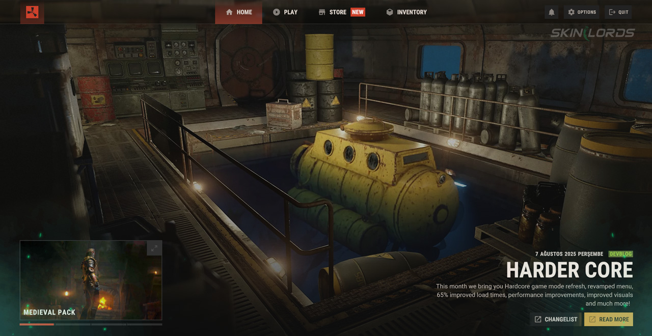
A Twitch drop tile has also been added, which will only show when active drops are running. Furthermore, a curated list will now appear bottom left of the menu showing weekly skins, DLCs, and information from the developers. Finally, a summary of the latest update can be found in the bottom right of the menu, highlighting the most important features.
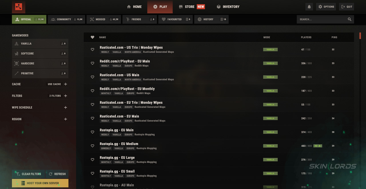
Play Tab Redesign
The Play tab in Rust’s menu has been redesigned to be full of new quality-of-life features. New game mode filters have been added alongside the original region, wipe schedule, and server type filters. After selecting a server, you will now have the ability to view the server’s website, map, and queue size, all from the comfort of the in-game menu.
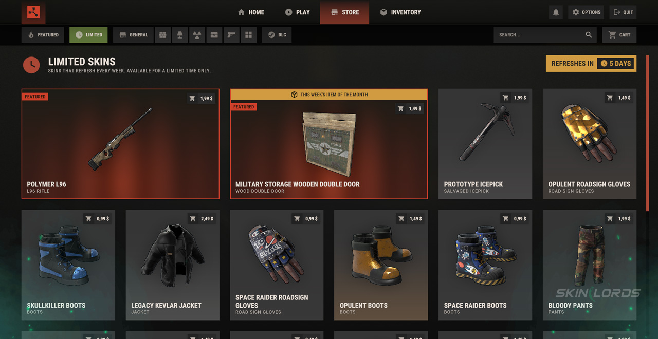
Improved Store Tab
Rust’s Store tab has received the biggest menu changes of them all, with a brand new horizontal bar of filters, including a search bar, being added to sort DLCs by whatever item type you’re looking for. A featured page has also been added showing the newest weekly skins and DLCs added to Rust. When selecting a skin or DLC, you will now have the option to view each skin individually using the skin viewer. This allows you to zoom, pan, and rotate skins in whatever way you want before purchasing them.
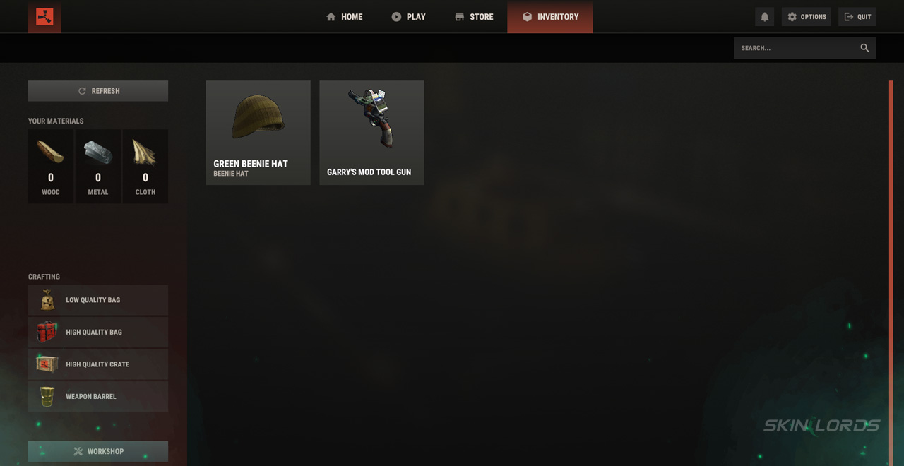
Detailed Inventory Tab
The inventory tab has been given lots of love, with the once laggy page now running extremely smoothly. The Rust menu redesign allows you to search through your skins to easily find and select what you’re looking for. Once selected, skins now show if they’re tradeable, their market price, if they glow, and if they’re a Twitch drop. Finally, the missing workshop tab, once always present, has been tucked away into the bottom left of the inventory page.
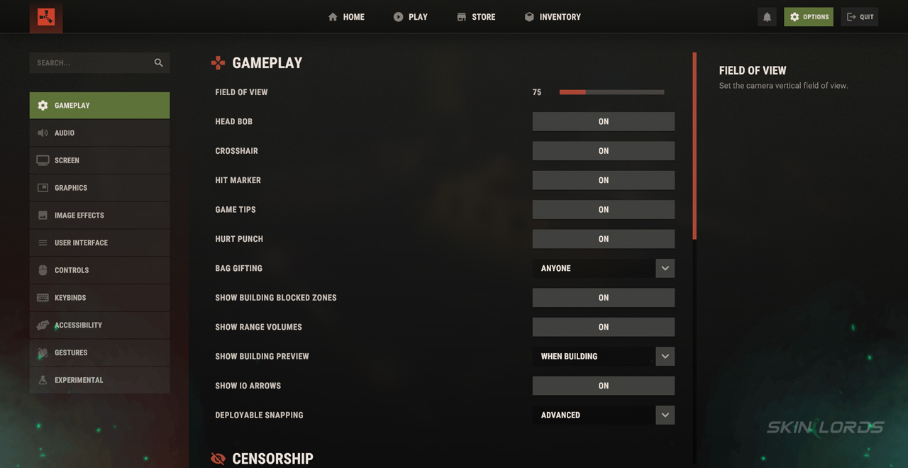
Improved Settings UI
Last but not least is the newly improved settings UI. All of the previous settings categories remain, however, the individual settings themselves have been grouped into their own sub-categories, making the menu easier to navigate. A search bar was also granted to the settings menu, allowing you to easily find the setting you are looking for. The gesture wheel has also been redesigned with a brand new, sleek look, which allows you to easily drag and drop your owned gestures onto your gesture wheel.
That’s everything that has changed in Rust’s menu redesign. The new menu runs much more smoothly and has vastly improved both mechanically and visually. If you enjoyed this article, be sure to check out our others, such as our full overview of the Rust Pilot Pack DLC, which was also added this month. See you next time!
Similar Articles
See all
Rust Guides
Rust Clan System: How to Create, Join, and Use Rust Clans
07.15.2026
0
45
Rust Guides
Rust BDU Shirt and Pants Guide: Stats, Protection & How to Get Them
07.01.2026
0
110
Related Casinos
Leave a reply